The Nike swoosh; McDonald’s golden arches; the Macintosh apple. These designs are deeply ingrained in our visual vocabularies, recognized in a space where image and commerce mingle. “Logos take the place of things,” says Tim Convery, a graphic designer and owner of Tim-Scapes in Provincetown.

Enterprising types have also long used logos to represent places. Think of that “I Love New York” design on so many T-shirts and bumper stickers that makes a brand out of a city. Closer to home, the simple image of a black dog has become synonymous with Martha’s Vineyard, both representing a shop and signifying the class and exclusivity that the island can suggest. Similarly, the wildly popular logo of Wellfleet’s Beachcomber represents not just a bar but also its location.
Touristy shops on Cape Cod are full of items trying to capitalize on the image of the Cape. Once in a while, something comes along and sticks, embraced by the public as a fitting symbol of a town. Tim Convery’s logo abbreviating P’town in stylized letters and the image of the Wellfleet oyster, combined with the town’s name on so many Cape vacationers’ T-shirts, are perhaps the two best-known examples on the Outer Cape.

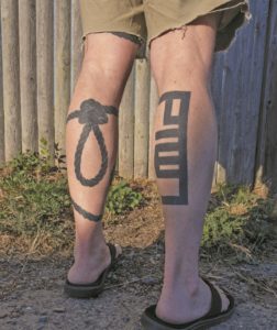
Convery, who was a graphic designer and creative director in New York for more than 30 years, first created his logo with duct tape. He says that it goes back to a day in the 1980s when he needed to quickly wrap a present. He used kraft paper, then taped his friend’s name on the box. “It was just something I did,” he says, but the creative gesture stuck with him. After he was fired from his corporate job (“thank God,” he says), he moved to Provincetown in 2010, determined to leave graphic design behind and do massage instead.
Design work soon lured him back. That winter he began creating an alphabet out of duct tape, designing his own angular type font. Come summer, his work was on display in town at the Foc’sle gallery. One piece spelled out P’town in only four letters. It soon became the logo on which he built a business.
“It is its own weird language — a hybrid of a name and logo,” he says. Like some ancient form of pictorial lettering or perhaps hieroglyphics, Convery’s logo sits in a space between image and text.

Alex Carleton, a designer and the owner of the now-closed Rogues Gallery, a nautical-themed vintage store, suggested that Convery sell T-shirts with his P’town logo at Rogues. They sold out in the summer of 2011, so Convery opened his own shop on Commercial Street in 2012. He has since expanded his territory, using symbols and four characters from his alphabet to represent over 200 cities.
“Provincetown can be hokey,” Convery says, “or too sexy. There wasn’t really anything approachable yet sophisticated,” which is how he describes his logo. He attributes its success to the way the image conveys a “young, cool, fun idea of Provincetown” as well as a certain insider status — it’s something people usually first encounter in person here.
He didn’t create it, but that Wellfleet oyster combined with the town’s name is a logo Convery admires. “I love that it’s intricate but really simple at the same time,” he says. “I love the serif typeface,” he continues. “It’s so classic Cape Cod.”
Whereas Convery is both the creator and the marketer of his logo, the oyster image has a more complicated history, one that suggests how hard it can be to secure recognition for and ownership of one’s graphic design work.
“I have the copyright to it,” says Jean Bessette of the oyster logo. Bessette is the owner of Ragg Time Ltd. on Main Street in Wellfleet, where sales from products with the logo make up the lion’s share of her business. She says she bought the design from Uncle Tim’s T-shirts when that business closed, then registered the logo in 1988. “It was created many years ago by an artist who lives in Wellfleet,” she says.

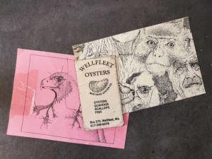
“I designed it,” says Paul Suggs, the artist who runs the Works Gallery, not far from Bessette’s shop. He made the logo in the late 1970s for his shellfish business, Mud Hake Oyster Company. The original image had his company’s name underneath the oyster with “Wellfleet Oysters” written above.
“I would do doodles with lines,” says Suggs, “and then I decided to do an oyster and change the lines so they looked like growth lines.” He used a technical drawing pen, with which he also made other pointillist drawings.
He had a slew of his oyster shirts printed in 1979 and took them to Lake Placid to sell at a raw bar he ran during the 1980 Olympics. Back on the Cape, a silk screener appropriated the design, according to Suggs. “I was her client,” he says. “I think I owed her some money. I was a slow payer. Next thing you know, she had a booth and had T-shirts up for sale” — sans his company’s name.

He made some half-hearted attempts to deal with the matter legally at the time, says Suggs, but didn’t follow through and has never benefited financially from the image over the years since. He doesn’t know how Bessette ended up with the copyright, but he notes the design she uses is not exactly the same as his original. And, in any case, he’s not concerned about it.
Convery wanted to safeguard his designs from the start. His lawyer suggested he patent his font and trademark the Provincetown logo. Even so, he acknowledges the difficulty of enforcing copyright ownership of graphic designs. “Unless you’re willing to spend a ton of money on lawyers,” he adds. Convery’s design was copied by a shop in San Francisco, but he never sued because of the expense.
What pleases Suggs, says his wife, Anne, is knowing he started a trend. “It’s a really good design,” says Paul. “It’s well balanced. It’s a strong image.” He has seen people all over the country wearing the logo, from Bar Harbor, Maine to California.
Inside Ragg Time on a hot summer afternoon, Graham Dias, 10, visiting from Park City, Utah, shops with his family for something bearing the Wellfleet oyster logo. He chooses a sweatshirt with the logo.
“It’s really cool,” he says. “It reminds me of Wellfleet.”


