Like Robert Motherwell, Judith Rothschild was a member of Provincetown’s legendary Long Point Gallery. She lived part of the year in Wellfleet and studied with the modernist masters Hans Hofmann in New York and Karl Knaths in Provincetown. Though her abstract artwork is monumental, she is probably best known for the Judith Rothschild Foundation — created in her will to support artists of her generation.

But Rothschild was also a “dedicated amateur pianist,” according to Jack Flam in Judith Rothschild: An Artist’s Search. And, as with Motherwell, who incorporated the music of his friend Arthur Berger into his collages (as reported in “Berger and Motherwell,” in the Jan. 21, 2021 issue of the Independent), Rothschild’s musical interests informed her work — sometimes quite literally.
In 1970, she wrote an article in the journal Leonardo titled “On the Use of a Color-Music Analogy and on Chance in Paintings.” In it, she describes a system for equating colors with musical chords.
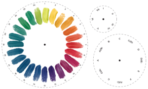
The article and, especially, the accompanying diagrams are confusing. Neither Flam, nor Justin Spring, in his essay “Judith Rothschild: Points of Light,” really crack it. But after lots of note-taking, doodles, and paper mock-ups, I found a way to make it work. To understand and use the system, I’ve created a movable color circle, below, which can be cut out.
Rothschild’s color-music analogy uses the Ostwald color circle, which has 24 hues. A musical scale has 12 half-tones. Because of this, mapping these colors onto the scale falls cleanly into place. Rothschild’s system is movable: the key of C doesn’t always correspond to red, for example. Instead, it’s about the relationships between related chords and the colors in the circle.

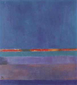
In the article, Rothschild analyzes her painting Nauset II. She writes that the blue color, corresponding to 14 on the Ostwald circle, is the tonic, or I chord. The red-orange band in the center, corresponding to 4 on the Ostwald circle, is the dominant, or V chord. The purples at the bottom correspond to the VI and VII chords.
Rothschild writes that paintings based on simpler music, like folk melodies, are the most successful. She describes an unfruitful attempt trying to create one based on Mozart’s Piano Concerto No. 23 in A Major.
A strength of Rothschild’s system is the analogy between contrasting colors and the relationship between the tonic (I chord) and dominant (V chord): “This elucidation suggests the difference (so clear in music) between dissonance and contrast,” she writes. “It is a common misunderstanding of the layman that contrasting colors, such as red and green, are in opposition to one another and therefore produce the greatest color tension.” Contrasting colors, instead, complement each other; likewise, in music, the dominant leads to, and complements, the tonic.
There are several problems with Rothschild’s system. It doesn’t differentiate between major and minor keys, and it doesn’t account for gradients of black or white. Besides — music unfolds over time, while a painting doesn’t. Ultimately, Rothschild admits her system is limited. But it nonetheless can be a useful tool for analysis and inspiration. Try your hand at it.
Take a Spin With Judith Rothschild

(1) Cut out the three circles. Overlay them, with the largest at the bottom, the medium one in the middle, and the smallest on top. Line up the dots and pierce at center with a thumb tack or, better yet, a brad. You will have a movable color wheel.
(2) Choose a piece of music, or a chord progression. Simple is best. Example: I-IV-V-I in the key of D.
(3) Decide what color will be the I chord, or tonic. This is the “key” the painting will be in. Example: Let’s say D is blue (14).
(4) Using the color wheel, line up I with the corresponding note and color. Example: Line up I, D, and 14.
(5) Finding what color corresponds to the V chord, or dominant, is easy — just see what it lines up with. Example: In the key of D, the V chord is A. This corresponds with red/orange (4).
(6) Do the same to find the IV chord, or subdominant. Example: In the key of D, the IV chord is G. This corresponds with yellow-green (24).
(7) Make a painting using these colors. The tonic color should be the predominant color in the painting. The dominant color should be right up against the “tonic” color for maximum contrast. The other colors can be wherever you want.
