When October rolls in and the sun is a low, luscious gold, the nights rich and cool and purple, two flowers bring us the colors of how October feels. Sunny days invite you to lie in a field and savor the warmth on your face. Nights are not yet ice blue in their coolness but still soft and rich and welcome.


Goldenrod and aster. Gold and purple. They grow in the meadows, along roadsides, at the edges of clearings, nearly always together, a perfect composition that draws the eye and calms you, wearing the colors of the day and night.
“Purple and gold, the heraldic colors of the king and queen of the meadow,” writes botanist Robin Wall Kimmerer of the fall-blooming goldenrod and aster in Braiding Sweetgrass: Indigenous Wisdom, Scientific Knowledge, and the Teachings of Plants. “A regal procession in complementary colors.” There is an entire chapter dedicated to these two flowers and the significance of their colors.
What is it about these two that would make me cross a field to be near them on the far side of a clearing? Why do I pull to the side of the road and get out of my truck to lean in close to them? The combination of these two plants, so often growing with one another, feels like something more than just a pretty sight. It has always felt like something calling to be witnessed. The first time I read Kimmerer’s description of these flowers I felt like I had found a letter revealing the truth to a mystery I had always wondered about.
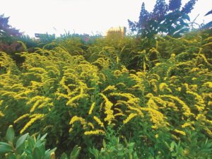
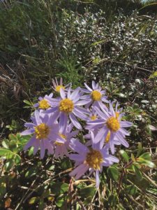
“God doesn’t play dice with the Universe.” Kimmerer quotes Einstein as she begins her explanation of the reasons behind our near lust for this color combination. “Color perception in humans relies on banks of specialized receptor cells, the rods and cones in the retina. The human eye has three kinds. One type excels at detecting red and associated wavelengths. One is tuned to blue. The other optimally perceives light of two colors: purple and yellow.”
We have evolved to see these specific colors. “The human eye is superbly equipped to detect these colors and send a signal pulsing to the brain,” Kimmerer writes. “This doesn’t explain why I perceive them as beautiful, but it does explain why that combination gets my undivided attention.”
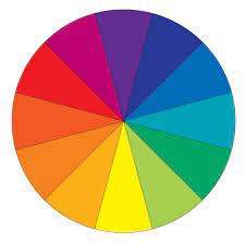
So why is it beautiful? Yellow and purple are complementary: they sit in opposition on the color wheel. Isaac Newton developed the first circular color wheel in 1666 as a way to organize color relationships. The wheel is a map of the colors visible to us and serves as a guide to help identify colors that work in harmony with one another. Colors that are opposite each other on the wheel work in reciprocity. The presence of one highlights the other. They create visual harmony. Orange and blue. Pink and green. And of course, purple and yellow.
Color theory helps us understand how we respond visually to color. It tells us what combinations are likely to feel good, to elicit a pleasing sensation when viewed. It is an organized reflection of what holds meaning for us. These color combinations feel right because they are a part of our very makeup.
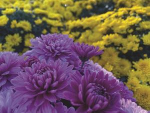
They are the colors of what we are a living extension of: an evening sky in blue with the orange-red warmth of the setting sun splashed across it. The gentle pink of the peach blossom resting on the new spring green of its leaves. And a flower named goldenrod that is itself a living spray of the October sun, and the cool-night and early-morning purple of the delicate aster growing side by side in the meadow.

