Provincetown is a high-density town. Case in point, what once was a small home in the East End with two buildings on a narrow lot recently became three condos squeezed into the previous buildings’ footprints. There was no room for the builder to go out for the 2021 down- to- the- studs new build, so he went up, doubling the one- and- a- half stories to three on the rear unit. For Ryan Stanton and Robbie Goldstein, prospective buyers, it definitely wasn’t love at first sight.
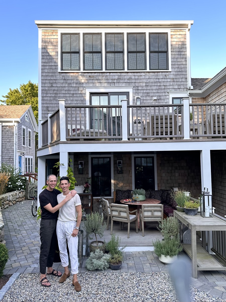
The vertical stack of rooms joined by narrow staircases posed both design and practical problems that the couple, who also live in Boston, felt they would not be able to overcome. “We looked at the property when it was about 60 percent done,” says Stanton. “I think a lot of other potential buyers struggled to figure out how to utilize the space,” which is only 720 square feet, just 240 square feet per floor.
Stanton, who has his own interior design company, Stanton Schwartz Design Group, was ready to move on with the search when Goldstein, the commissioner of the Mass. Dept. of Public Health, came up with the idea to rethink the floor plan and change the two-bedroom unit into a one-bedroom, freeing up a top floor aerie that’s now a secondary living area. “For me, that space was the reason we bought the house,” Goldstein says. “It has everything I want for a place in P’town. You can see out over the town and the sea.”
Once the layout was resolved, the couple asked the contractor to stop speccing the remaining materials and fixtures so they could personalize the project as it was being finished. “It was basically just white walls and subflooring, so I was able to get my hands on all of the paint colors, the marble, the hardware, the bathroom fixtures, the vanities, and all of those types of details,” says Stanton. “I had the chance to layer in our own flavor. It was, quite honestly, an interior designer’s dream come true to be able to get in early.”
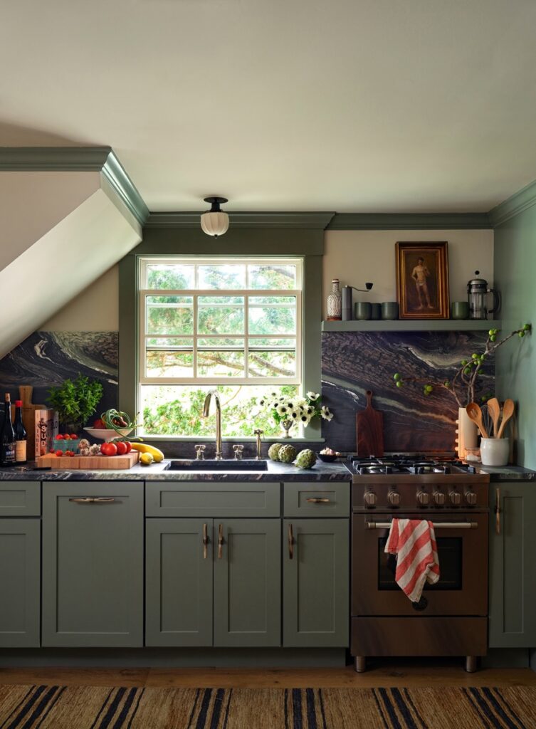
Much of the house’s sophisticated color scheme is inspired by a certain piece of stone that Stanton had tucked into his memory. “Two years before we bought the house, I went countertop shopping with a client and fell in love with the Italian marble that you see throughout the house,” he says. “I found it completely mesmerizing from the instant I saw it.” Finally able to use it, he deployed it liberally in the kitchen counters and backsplash, the upstairs bathroom, the third-floor built-ins, and even a little remnant on the outdoor patio. Its rich palette of dark greens, pinks, and blacks in wave-shaped patterns inspired the fabric and paint palette that knits together the entire house in ways not normally seen at a beach residence. “We could have gone with more of a super-casual beach feeling, where the furniture is more of an afterthought,” says Stanton. “But we didn’t want to get too formal either.”
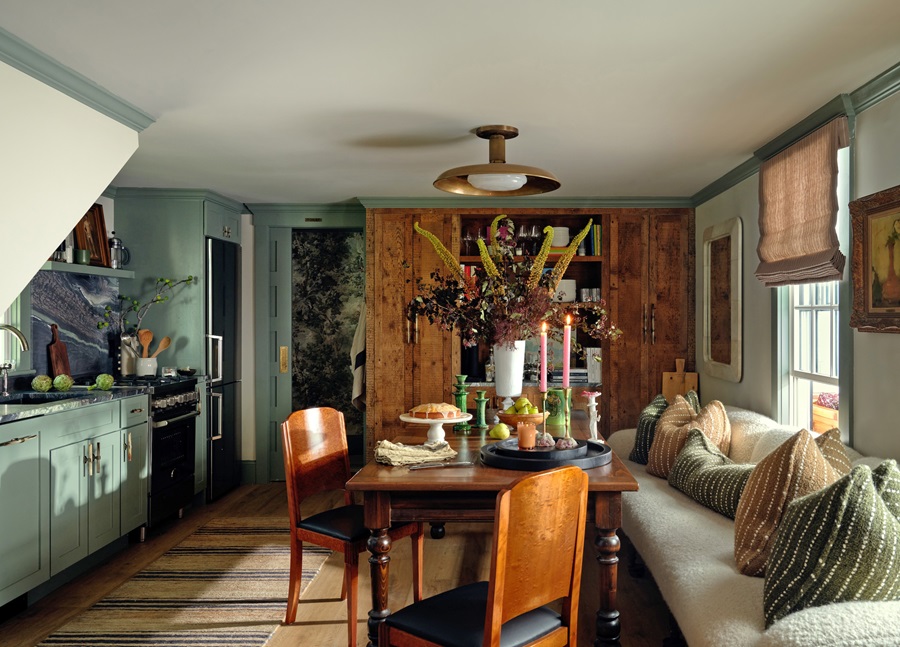
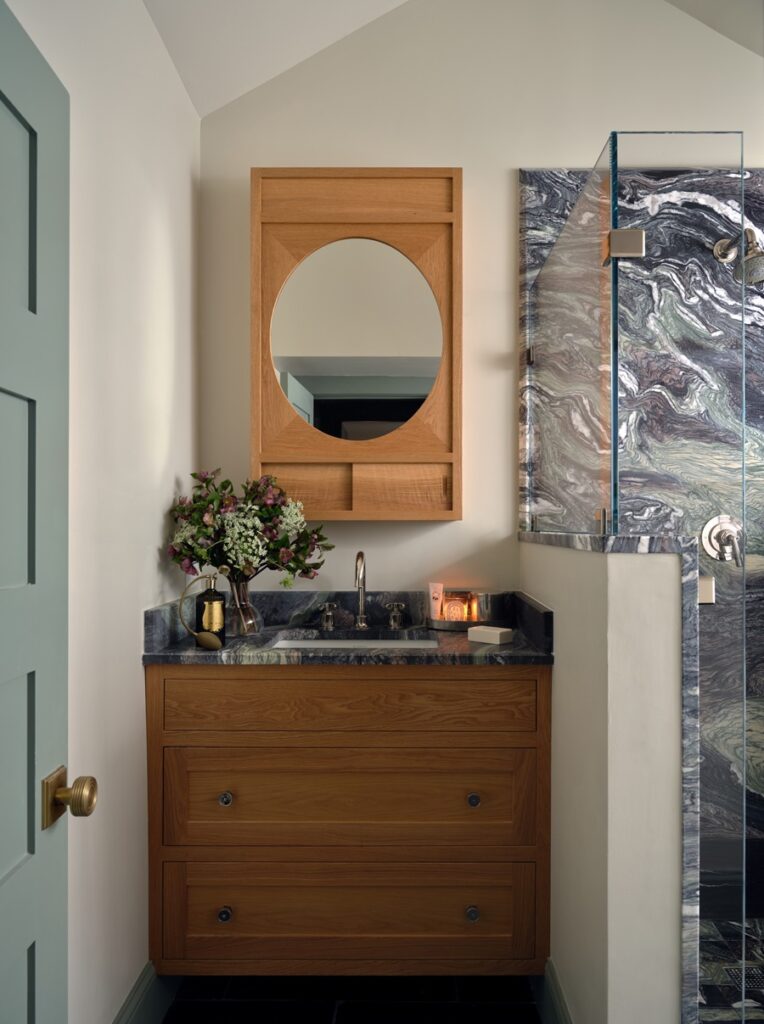
To tackle the problem of the small rooms, Stanton turned to lessons he had learned designing other people’s homes. “We tried to scale things on the larger side,” he says. “People feel like they should do the opposite and go smaller with the furniture and fixtures. For instance, over three floors we have four very large sofas indoors and out. We wanted to make sure it was a place where as many people as possible could be comfortable.” Many of the design solutions involve built-ins, since there was no way to get couches or armoires up the slim stairs and hallways.
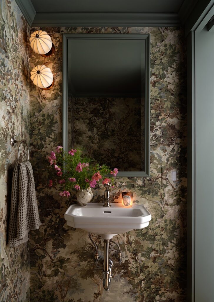
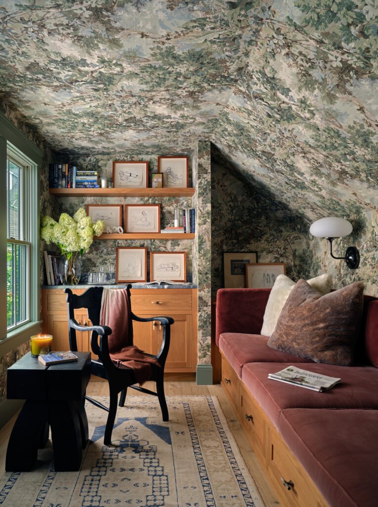
Stanton took other chances that most people would find risky in compact settings, such as a liberal use of patterned wallpaper both in the first-floor powder room and the top-floor den. “When I first walked into the space as it was being built, everything was stark white,” he says. “I’m naturally moody, so I tried to find ways to layer in a mood.” Stanton had been waiting for a chance to use the wallpaper. “No client ever wanted it, but I went big and covered the walls and ceiling. When the windows are open it feels like you’re in a tree house. It brings down your blood pressure.”
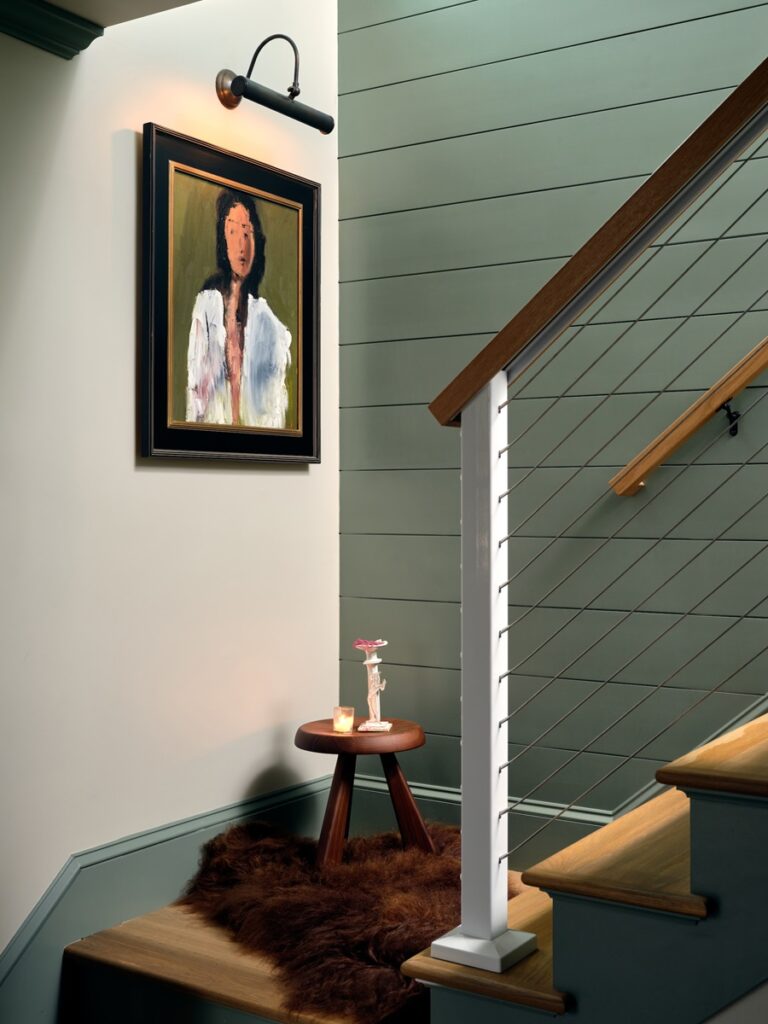
Stanton also had the luxury of being able to tap his various vendors to think through custom built-in storage possibilities because of another odd aspect of the house — it has no closets. The undersides of the bed have built-in drawers. The nightstands are also used as dressers. “Thankfully, we have additional storage in the basement for things we don’t access much,” he says.
The house is built for entertaining. Goldstein, who is a passionate cook, loves having people over, whether it’s two or 16. “Robbie’s task is always the menu,” Stanton says. “We’re never in the kitchen together, because that’s a recipe for disaster. My task is ambience.” The house has speakers on every floor and the same candles burning throughout the house so that guests are receiving the same subtle scents and sounds as they move up and down the stairs. Goldstein loves the feeling of having a lot of people around one of their indoor or outdoor dining tables, even if it can be a bit tight. “For me, it’s that cozy feeling you get being surrounded by friends while you’re eating,” he says. “I think the Danes call it hygge.”
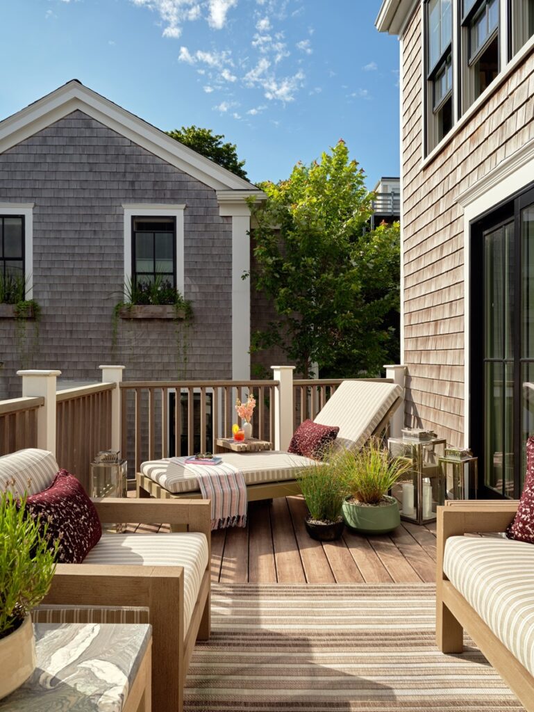
This is a social house that’s meant to entertain guests, even if most of them can’t sleep over. “Our friends are still angry at us that we did not keep the second bedroom,” says Stanton. “So, yeah, this house is designed to entertain — but it’s also designed to be a nice refuge once people leave.” As nice as it is to see guests come, it can be just as nice to see them go.


