I knew I would have to make compromises when I was in the market to buy a house here a little over a year ago. Along the way, I saw more than my fair share of awful kitchens, most of them design time capsules with outdated tile and flimsy cabinets. When I finally found the house I wanted, one thing I thought was an asset — a newly renovated kitchen — turned out to be the opposite.
I tried to be grateful for the updated kitchen in my 1988 colonial, even though I recognized that it didn’t fit me style-wise. I figured I could live with it and save some renovation costs, and guests would even say, “You’re so lucky to have this kitchen!” But a few weeks after I moved in, it started to get to me. The room was too closed-in and dark.
Daydreams filled my head — of a breakfast bar for the kids, an open floor plan that matched how I like to get together with friends, and sunlight at all hours of the day.
Being an avid DIYer, I grabbed a hammer to see what I was working with. I began by removing all the upper cabinets. I have an aversion to them: they impose a heaviness I don’t think many kitchens can absorb. I prefer open shelving instead. To me, if the kitchen is supposed to be the heart of the home, it ought to be airy and rhythmic, with an equal focus on functionality and flow.
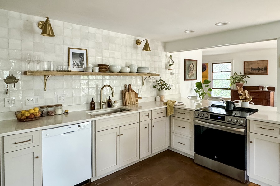
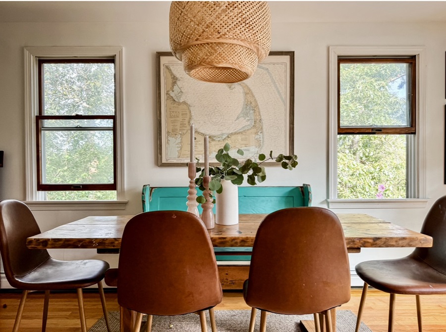
Once I removed the drywall to reveal only the framing, there was no turning back. The light that streamed in was as transformative as I’d hoped. I hit a snag, though, when I learned that the wall behind the stove was loadbearing. Installing a loadbearing beam is not a basic DIY project. It can be costly and time-consuming. So, I reinforced the existing construction with a header (a beam over an opening that carries the structural weight) and jack studs, which sit below the header for added support on each side. This created a picture-frame opening to a breakfast nook adjacent to the dining area. It provided the openness I wanted without my having to invest too much money or work.
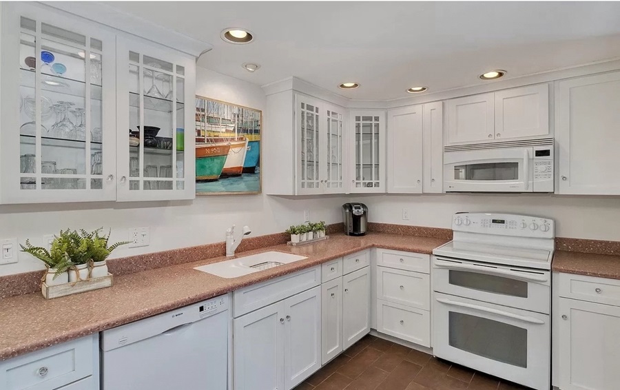
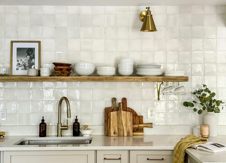
Thanks to a surplus of pantry space along the far wall, I was able to use one simple poplar shelf sourced from Northern Wild Design in Eastham to hold my tableware and be a design accent at the same time. I supported the shelf with floating brackets plus two ornate brass ones to tie into the sink hardware. Then I replaced the dated speckled pink laminate countertop with a large- format white quartz slab marbled with a warm brown from Granite World in Harwich — they also did the installation.
The stark white lower cabinets had a sterile vibe, so I rolled them with a Behr cabinet paint, Aged Beige, and added antique brass pulls, which give the cabinets a rustic farmhouse feel. Then I stacked five-inch white ceramic tiles with a reflective, slightly wavy surface in a grid pattern that adds much more interest than generic flat white ones.
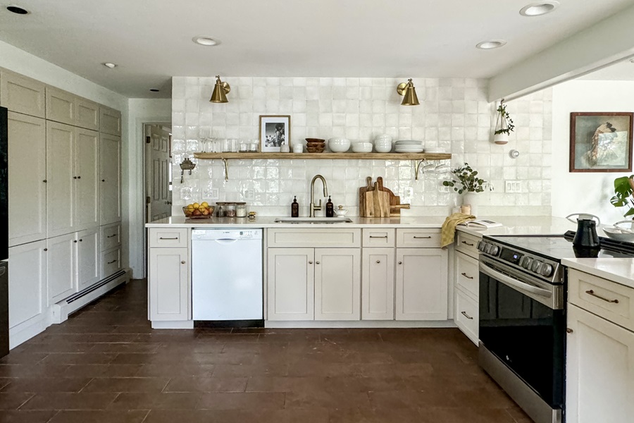
By making natural light the focus of this kitchen makeover and letting that goal guide a few well-chosen changes, I was able to avoid the expense of a gut renovation and still create a more inviting and functional living space for my family and for guests. I really am lucky to have this kitchen.

