Diana Horowitz grew up watching her mother, Brenda Horowitz, paint. Their family spent summers in Provincetown, where Brenda had studied with Hans Hofmann and Wolf Kahn. During the year, they lived at Westbeth, the subsidized artist housing complex in New York City’s West Village. Diana followed in her mother’s footsteps and became a painter — albeit one with a very different color sensibility. Still, she hasn’t stopped looking over her mother’s shoulder.
Brenda is now 93 years old, and she does only two things, says Diana: she reads and she paints. “She has no interest in anything else,” says Diana. Brenda continues to live at Westbeth but won’t be returning to Provincetown this year. She has shown at Berta Walker Gallery for three decades and still paints every day, always scenes from Cape Cod. And despite the objections of her daughter, Brenda always paints standing up.
An exhibition of Brenda Horowitz’s work will be on view at the Walker Gallery through June 15. — Dorothea Samaha
Q: Diana, your paintings are very different from your mother’s. What’s distinctive about the way each of you works with color?
I always think that her paintings come out of the Hans Hofmann school, and mine come more out of the Edwin Dickinson school. We’ve had different paths. I was attracted to middles tones, more naturalistic color, and a more muted palette, probably, in part, to distinguish myself. She uses color more emotionally and expressively.
Q: Are her vibrant colors imaginative or observed?
She never really relied on the color she was seeing. It was always out of her head. Her paintings are always studio paintings, and she works intuitively with color. She thinks of herself primarily as a colorist, and in her paintings of the Outer Cape she has come up with her own color vocabulary.
I think she’s looking for a kind of electricity or a charge from the color. She’s trying to interpret something she finds beautiful and translate it into some kind of electric moment.
Q: How has Brenda’s use of color changed throughout her career?
Her color has changed a lot over the years. She’s had very different periods of work, but the paintings with bright magentas, reds, and purples are from the last 25 years or so. Before that, her palette was a lot more muted.
Q: There’s a lot of purple in her work. How does it typically function in her paintings? Because it’s a secondary color, is it more malleable than other colors?
I have observed purple and magenta in her work my whole life. There are so many kinds of purple, and they have so many different feelings. If a purple tends toward blue, it’s a different mood than when it tends toward magenta. Unlike blue, which is a color that supposedly everyone is attracted to, purple is more mutable.
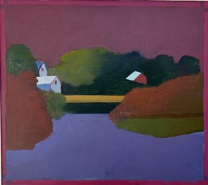
Q: How do you feel the purple is working in Pond Village?
In Pond Village, it’s very simplified. It expresses a little bit of melancholy, but also beauty. It has a slightly mysterious side. It’s imagined color — I don’t think it’s something you’d see in real life. I guess the mysterious thing for me is that it’s not something you see, but it’s something that you can feel.