Provincetown artist Paul Kelly begins to work on a new painting by creating architectural graphite sketches. There is a certainty to Kelly’s sketches — a commitment to contrast and shape. Then he covers his canvas with construction-hat orange oil paint and lets it dry in the corner of his studio.
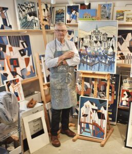
He maps his painting in graphite over the orange paint and layers in shape, line, and color with his brush or palette knife. The base paint becomes a foundation that the painting is layered over. This creates an impression that the work is carved or cut: the beginning of Kelly’s cubist constructions.
Kelly’s work is sharp and crisp, rigid in form and shape. Patterns pop with contrast and bold colors. There’s never just one house but a series of fish shacks, never one wooden pier but a stack of piers that extends beyond the confines of the painting, never one boat on the water but five boats floating up the pier. Kelly manages to pack an entire harborscape into one painting, including all the motorboats, all the wooden beams, all the shacks — everything neatly managed. From a distance, there is a sense of decadence and detail, while up close a viewer can witness the simple elegance of his process, a series of sharp decisions.
Kelly’s paintings are of a town gone wild, almost like a roller coaster made up of Provincetown structural elements. Navy blue shadows appear on rooftops or under piers. We see a town like an architectural model, a perfectly built environment, and we are amused and entertained. His lines and colors all serve the mapped-out quality of his imagination. Seeing the paintings together on long shelves in his studio is a feast for the senses. The smell of oil paint fills the space. Quick gestures show up on his apron.
Kelly’s studio is a converted garage across from his house; it used to be part of the storied Cape School of Art. Plants line the gated front. Kelly stands inside the studio in shiny brown shoes, black slacks, a pale-blue-and-white-striped button-down shirt, and black-rimmed glasses. He has a crew cut, skin-tight on the sides, and holds a small white cup of espresso. The paint on his Payne’s apron is not wild. The strokes are measured and thoughtful. He keeps between the lines.
Kelly is in the studio most days, usually in the afternoon. He procrastinates. “If I can get over here for two or three hours on a regular basis, that’s what works for me,” he says.
He paints from his imagination, where elaborate patterns take hold. His background in architecture allows his work to express freedom within a field of constraints.
Kelly, who is 84, graduated from Syracuse University in 1966 with a B.F.A. and earned an architecture degree from the Rhode Island School of Design in 1972. He worked in England for a few years before returning to Boston. He and his partner, Ed Dusek, have been together for 50 years.
The pair met at the Boston Redevelopment Authority, the city planning agency, in the urban design department. They started Manitou Architects in Boston, which built residential and coastal homes along with smaller commercial buildings in Boston, Rhode Island, and Connecticut.
“If you look at a set of construction documents from those days, your plans were drawn with pencil,” Kelly says about his early years as an architect. “The actual blueprint would be a very beautiful thing. It’s all part of the creative process, even if you’re just drawing window details.”
Kelly remembers traveling with sketchbooks instead of a camera. He says he remembers more through his paintings than he does through photographs. “Twenty-five years later,” he says, “I can remember more about a spot through sitting, drawing, looking. You can really capture what you’re looking at.”
Kelly says he likes working in pencil because it’s soft and you can smudge it. For some of his work, he looks at Google Maps but uses perspective and his imagination. He goes “on and off an idea,” he says, and pulls it together on the canvas.
He has taken many courses at the Provincetown Art Association and Museum and the Fine Arts Work Center. He tries to go to PAAM once a week for figure drawing, a good discipline that he says keeps his eyes sharp.
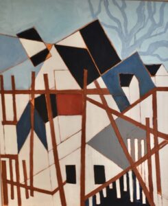
In his oil on canvas titled Safe Harbor #12, Kelly has done away with most three-dimensional elements and gives us a flat interpretation of the town and pier colliding and overlapping. The top of the pier cuts underneath a blue rooftop and almost through to the dormer. The pier does not seem to be above water; beams create a frame for looking into the town, which seems to be unfinished.
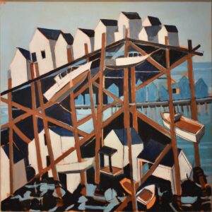
In Safe Harbor #14, boats climb up the beams of the pier, which rises as high as the Sagamore Bridge over fishing shacks, houses, and boats below. The pier supports nine fishing shacks. The blue shadows of pointy rooftops loom in the distance, making the pier look hulking and wild. Kelly has broken up the picture plane to center and exalt the pier.
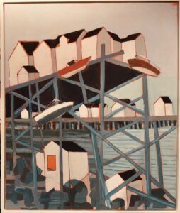
The same is true in Safe Harbor #11, although here his shapes are simpler. The sun must be overhead, as the shacks on the distant pier are in full sunlight. Details of shacks and boats are turned into simple trapezoids and rectangles. The orange base layer pulls through and brightens each line.
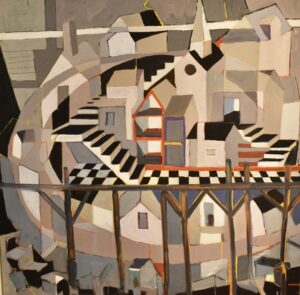
A checkered black-and-white staircase runs across the center of Carnival Day #3. Kelly’s structural futurism is on full display here, combining interiors and exteriors, steeples next to exterior staircases. This work is like a fountain of structure, a town amusement park. Certain buildings break the fourth wall: their interiors are open to us. The outer corners of the painting are not as detailed and developed as the central shacks, apartments, staircases, and the church. Buildings are not all finished, yet their representative shapes are, as in the sweeping shark-fin gray shape on the lower left. The more muted, earthy, light brown tones are concentrated more on the outer rims and help brighten the vivid orange lines.
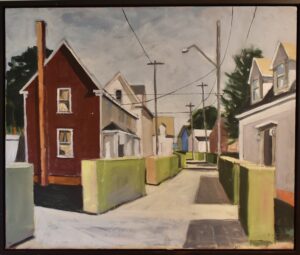
Pearl Street Hedges showcases a more traditional street scene, yet the bushes appear modular, they are so perfectly constructed. Their tight right angles create a sense of surveillance in the neighborhood. The long carrot-stick chimney, the overcast gray sky, the two tomblike shadows of the hedges — all perfect.
In NE Harbor #6, Kelly has invited us into his imagined version of Provincetown, which features checkered dance floors, staircases, and the chopped top of the monument next to open-faced houses. The town is bound together like a fancy mall — built environment after built environment, with the center being the steeple of town hall. This reimagining is enough to make the town assessor scramble to construct a new map. Kelly’s decorative expertise is in full force, the royal blue pier making reflections on the water through simple strokes. Nothing is overdone. Crisp shapes, repetition, and thick lines are enough to draw the eye.
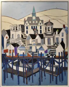
Provincetown Town Hall, steeples, the monument are on pier beams in the painting. “People like to take something home that has to do with Provincetown,” he says.
Kelly is represented by Alden Gallery in Provincetown, where he will show 14 paintings along with sculptural works by Mike Wright in an exhibit running from July 12 through 25.
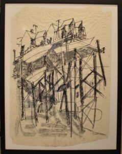
Kelly’s Preliminary Drawing for the Safe Harbor series is also in his upcoming show. He invites us into his process, which is simple, clear, focused, and without secrets. We see his ability to make decisions despite his looseness. His freedom allows him to settle on what he knows. His sense of structure, contrast, and mapping comes through.
Kelly and Wright at Alden
The event: An exhibition of artworks by Paul Kelly and Mike Wright
The time: July 12 through 25; opening reception, Friday, July 12, 7 to 9 p.m.
The place: Alden Gallery, 423 Commercial St., Provincetown
The cost: Free

