It happens from time to time: Tim McNulty, the owner and executive chef at the Lobster Pot in downtown Provincetown, will step outside and find an artist peering up at the neon lobster that has hung above the restaurant’s front door for as long as his family has owned the place.
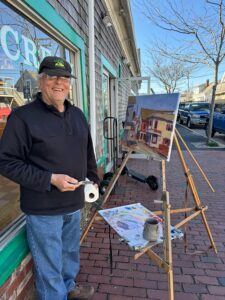
Last month it was Steve Kennedy, who had set up an easel outside Lewis Brothers Homemade Ice Cream on the corner of Standish and Commercial, pointing his brush and palette in the Lobster Pot’s direction.
It reminded McNulty of the day in 2005 when he became so enamored of a painting that a young artist was making of the restaurant’s facade that he made an offer on the spot. “This guy was painting out front,” McNulty says. “I went out and said, ‘You selling that?’ I bought it right off him — it was still wet.”
In a place renowned for dunes and storied symbols of seafaring life — not to mention drag brunches and tea dances — it is a retro piece of blazing neon that may say “P’town” louder than any other landmark. The town’s regulations governing signs now prohibit neon. But the Lobster Pot’s famous sign predates the comprehensive zoning bylaw passed in 1985, so it is “grandfathered” and therefore legal as long as it does not change. It serves as both a beacon of light beckoning tourists and a steadfast symbol of tradition in a community buffeted by the tides of unrelenting and often unwelcome change.
Chris McCarthy, CEO of the Provincetown Art Association and Museum, is not surprised that artists are drawn to the sign. “Artists have been inspired not only by the natural beauty of Provincetown but by the streetscapes, in particular iconic buildings and structures,” she says. “Just as one artist might be drawn to the dunes or the bay, others are curious about text and signage, pops of color, logos, and neon.”
That was certainly the case for Taro Yamamoto (1919-1993) whose undated oil painting Provincetown #3 is believed, surprisingly, to be the only depiction of the Lobster Pot in PAAM’s collection of some 4,000 artworks. Yamamoto lived on the Outer Cape from 1955 until his death and was a student of Hans Hofmann.
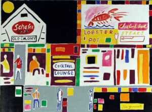
Provincetown #3, a corner of which appears unfinished, contains both abstract and representational elements, with bold colors occupying different planes in a flat field. To McCarthy, the work shows Yamamoto’s use of Hofmann’s push-pull theory of color emerging or receding on the canvas, “creating a three-dimensional feel within a two-dimensional picture plane, layering and building shapes and textures through the use of bright colors.”
PAAM archivist Jim Zimmermann says that the painting has become a favorite of the town’s schoolchildren, who have chosen it over and over again for student-curated exhibitions at the museum.
Most contemporary renderings of the Lobster Pot sign and building are far more representational, but artists offer different rationales for the sign’s power.
David Hinchen, a self-described architectural artist who depicts urban landscapes sans people, has painted and drawn the Lobster Pot numerous times, including a pen-and-ink sketch commissioned by the McNulty family and used on restaurant menus and memorabilia in the 1980s.
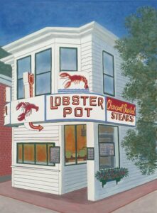
“The buildings are the complete statement,” he writes of his approach. “Within their lines and the mood they evoke, the people who built them and lived in them are revealed more clearly than if they had posed for a portrait. There is a hard, beautiful dignity in weathering all those years — pure and uncompromising.”
Hinchen believes vintage signs and antique buildings are “significant carriers of cultural memory,” offering a sense of stability in a rapidly changing environment.
“The beaches look very different than they did 20 years ago,” says Hinchen, who owns a gallery in Albany, N.Y. and spends summers in Truro. “We’re going to see a lot more change in the next 20 years. But, through it all, the villages of the Outer Cape maintain their architectural integrity.”
Hinchen begins every painting with a pen-and-ink sketch and then builds layers of color with thin washes of acrylic paint, creating a smooth matte finish. His images of the Lobster Pot and other buildings and vintage signs are painted from the perspective of the person looking at them, “so there’s a human presence there but you don’t see it.”
In contrast, Salem-based artist Chris Firger paints people “interacting with space,” he says, whether they are hiking through woods or crossing Commercial Street. To him, the interplay between pedestrians and the built environment shows what is unique about Provincetown.
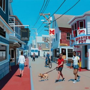
“While the painting includes the Lobster Pot, what I truly wanted to be the focus was the essence of that intersection on a summer day, the energy of that area,” he says.
Firger was less interested in the neon sign than other artists have been. “Honestly, the stark white of the building is what jumped out at me against this bright blue sky,” he says. “It must have had a fresh coat of paint the day I was there.”
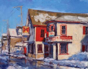
Steve Kennedy, the Provincetown artist Tim McNulty encountered on his recent stroll, has been painting Provincetown since the 1980s. He’s made numerous studies of the Lobster Pot, including a winter scene in oils now on view at the Kiley Court Gallery.
“What I was going for in that painting was the sheen from the melting snow in the road,” Kennedy says. “I experimented with pure suggestion so that the buildings are focused, but if you look to the left of the painting, it’s basically just a number of shapes and patches of color, abstractions that the imagination of the viewer would get involved with.”
Ann Gorbett, whose artwork is displayed at the Red Inn, says the Lobster Pot is among the most requested images when she is commissioned to paint a Provincetown scene. Often, the buyer is a tourist with fond memories of family celebrations at the restaurant. For an artist who paints exclusively with a palette knife, it’s also among the most challenging.
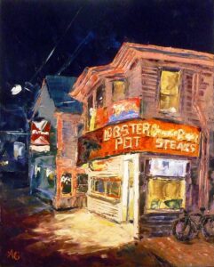
“It’s the typography,” she says. “The words ‘The Lobster Pot’ are in all caps, but then you get the ‘Charbroiled Steaks,’ which has a lot of curves, a lot of detail, so that’s especially difficult to do with a palette knife.”
Gorbett does not use a solvent when she works; in fact, she adds a medium to thicken paint, creating bulk and texture in each piece. In her depictions of the Lobster Pot at night, the artist surrounds it in subdued shades of inky blue to draw the eye to the restaurant’s warm, nocturnal glow — pinkish in one rendering, amber in another.
She believes the restaurant’s enduring appeal to artists is the “vibe” of the building itself — “the way the sign wraps around the front, the way the windows are placed — it’s a unique structure, not really part of an architectural style that you could point to. It’s funky, quirky, retro.” Exactly the qualities that lure so many, artistic and otherwise, to the town the Lobster Pot inhabits.
