Mike Wright, who has lived in Provincetown since 1984, makes abstract sculptures out of found wood. She has requirements for her materials: the wood must be from Provincetown, and it must have paint on it. She often recreates the work of modernist painters in her own style. Her sculptures, which she makes in her home workshop, are shown at the Alden Gallery. —Eve Samaha
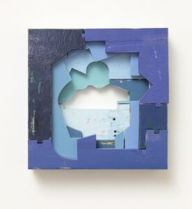
Q: Where did you find the pieces of wood for this work?
Every day, I do a little drive around town to see what I can find — mostly in dumpsters. I find a lot of white and blue. People are always painting things blue, I guess. In Into Sea, that very pale blue in the back was a piece of a boat that washed up on the beach. The plank had been floating in the sea, so it’s been patinaed by the sand and the salt and the waves. Some of the other pieces were parts of Adirondack chairs. In my studio, I sort all the colors of wood, and I have a nice stash of blue that I can pull up all the time and move around.
Q: What does the color blue suggest to you?
Because I drive around Provincetown every day, I always make a point to go look at the bay, the harbor, and the sky. The blues are always so varied in the sky and the sea. There’s ultramarine blue, and there’s a pale light blue in the summer sky when it’s humid and hazy. There are teal colors in the bay, especially near the shore, where the water is less deep. And in the middle of winter, the bay is dark blue. I have all that in my head all the time. Blue is kind of a big hug all around us, because we’re surrounded by the sea. It feels like we’re held and comforted. It’s a comforting color.
Q: Do you think about color when making your constructions? At what point does it become a consideration?
Most of the time, I don’t have a plan. I don’t do drawings or sketches ahead. I’ll sit in the studio, and something will catch my eye. I start by moving pieces around until something clicks. Sometimes it seems like one piece wishes to be next to another. It’s unplanned and uncontrolled — it’s a real freeform way of working.
Q: In Into Sea, why did you use a lighter blue in the middle of the composition?
I wanted to give the illusion of depth. And the way you do that is by having your darker colors more forward. Then, as you move back, the next layer is a little lighter. Then, the final layer in this — it’s just three layers deep — is much lighter. It’s almost like a reflected summer day, and that really pale blue is the sea itself that you’re looking into.
Q: This almost looks more like a painting than a sculpture. What’s the relationship between painting and sculpture in your work?
Into Sea is an illusion of a painting. And it’s literally painted by someone else, not me. The dark edges are kind of like a frame. It’s all playing with the concept of a painting. I mean, really, what is a painting? You apply shades of color to a surface. But I happen to work with stuff that’s already been applied to a surface. I’m playing with the viewer — I’m making a painting, but I’m really not. In a way, it’s a joke. I’m just having a good time.