Few things make me happier than adding color to walls. As a decorator, I know that nothing else creates the same effect so quickly. But recently, I’ve had a lot of requests for wallpaper instead. As the pursuit of serene minimalism over the past decade has slowly given way to interest in more layered, eclectic interiors, wallpaper has naturally gravitated into the design mix.
First, there were experiments with bold patterns on powder room walls. Next, textured grasscloths made a resurgence. And more recently, clients have said yes to scenic murals on bedroom and dining room walls. Now, nearly every project I work on incorporates wallpaper somewhere.
Wallpaper’s earliest uses were to line small areas like cupboards and trunks, according to the Victoria and Albert Museum in London, which has an important collection of wallpaper designs dating to the mid-1500s. By the 20th century, following improvements in printing technology, it was showing up everywhere, covering the walls of nearly every Gilded Age house across all levels of income.
Today, wallpaper has found a comfortable middle ground; it’s being used for a variety of effects in a range of spaces, and it is available in countless styles. Technology has allowed for faster printing and easier installation, and that has evolved to include a good number of choices in the peel-and-stick category (for which you need little more than a few household tools, a little patience, and a commitment to measuring twice).
With wallpaper, though, the range of possibilities can be overwhelming. There’s color to consider, of course, but I don’t start there. I go first to scale and mood. Color then becomes a way to winnow favorites. If you’ve wanted to consider wallpaper but haven’t been sure where to start, try exploring these four groupings to set a direction. They’ll lead you to choices that are right for your space.
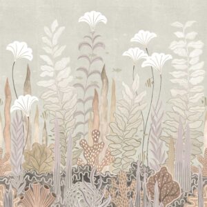
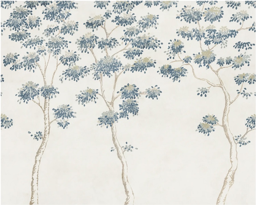
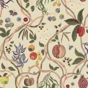
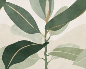
Pretty Perennials
Florals were among the earliest wallpaper motifs, as designs were usually copied from embroidered textiles. Choosing a pattern that is rooted in nature complements most interiors. I recommend looking to the colors outside your window, then decide if you want to highlight or contrast that palette to narrow the field.

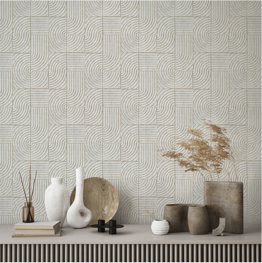
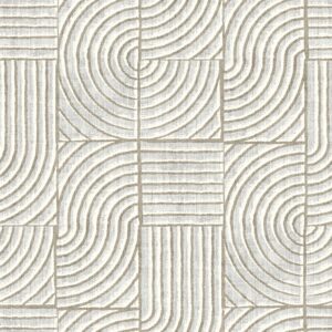
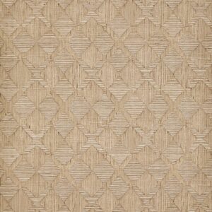
Architextural
Sometimes, rooms need a bit of dimension to add subtle interest. In these cases, I look for papers that will create depth through a trompe l’oeil effect. The digital printing capabilities are so good now, it is often impossible to tell these are not truly textural.
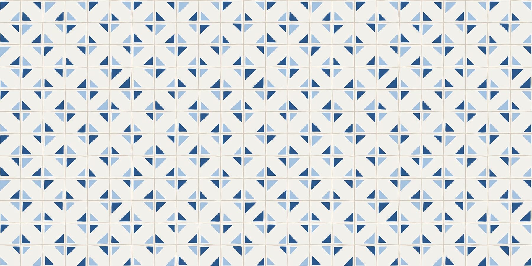
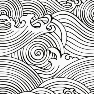
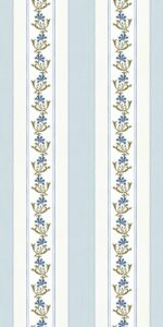
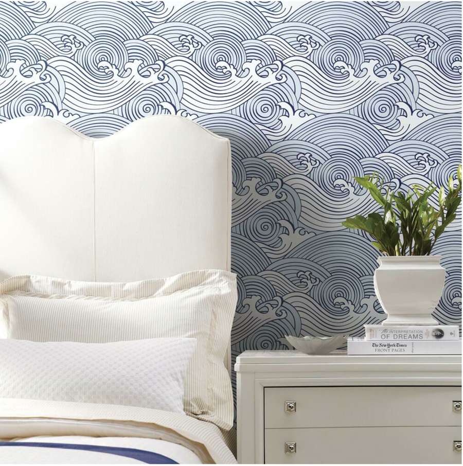
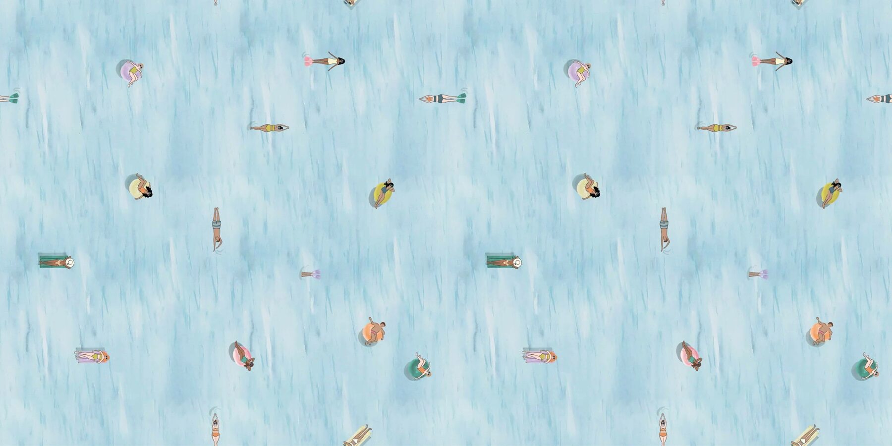
Nauti-Chic
One of the best ways to revive a tired space is to have fun with it. Embodying the relaxed feeling of summertime, these nautical-inspired designs set a playful mood that offer reminders of the pleasures of living near the ocean.
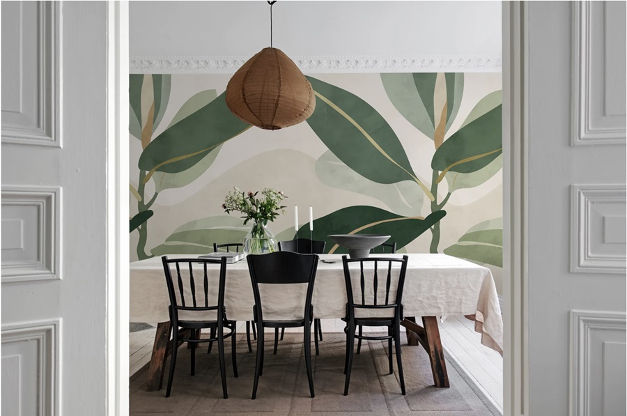
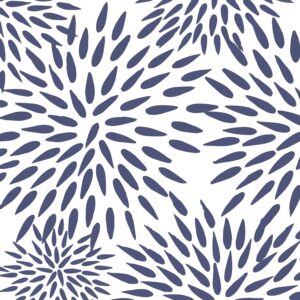
Grand Gestures
Scale is always the most important element in a room. Patterns with large dimensions create a strong focal point and a sense of cohesion.