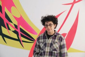
Dani Levine’s studio at the Fine Arts Work Center, where she’s a visual arts fellow, feels like an old-time painting workshop transposed to the present. “I like the notion of time travel with painting,” says Levine, who enjoys science fiction. Her imagery and colors reach across time: she works with pictures from 1970s feminist and lesbian zines and paints with everything from synthetic fluorescents to earthy pigments that have been used for thousands of years.
Levine’s workspace suggests the idea of painter as alchemist or magician — a manipulator of materials for expressive means. In one corner is a cabinet full of ground pigments, chalks, oils, and gum arabic crystals. On the windowsill, a copper pipe sits in vinegar to create verdigris, a bluish-green pigment. Tables covered in glass fill the center of the studio, where Levine makes her own paint, grounds, and mediums. The smell of oil paint permeates the air. For Levine, materials aren’t just a means to an end; they are central players in her practice.
Levine grew up in Miami, where she attended New World School of the Arts High School before going to the Rhode Island School of Design. There, she studied illustration but gravitated to painting just before her senior year. She had attended the six-week summer Yale Norfolk School of Art and got “hooked on painting,” she says. “It could be much more than just an image,” she discovered.
After graduating from RISD in 2012, Levine moved to New York City and did an internship at the David Zwirner Gallery, where she spent time looking closely at paintings by contemporary artists like Chris Ofili, Suzan Frecon, and Charline von Heyl. Frecon’s paintings, known for their minimal forms and carefully modulated surfaces, were influential. “There’s a rigor to their simplicity and materiality that felt earned,” says Levine.
After attending graduate school at Yale, she worked at Kremer Pigments in Manhattan — an art store known for producing its own pigments and handmade art materials. Outside of work, her own practice became increasingly focused on exploring materials.
Making her own paints helps Levine achieve the glossy or matte finishes, opacity, transparency, and weight or airiness that she’s looking for. Her paintings, often abstractions of forms she has observed, revolve around finding balance between these elements.
“Pigments have such different material characteristics,” says Levine. “For example, greenness or transparency or opacity are inherent qualities in pigments, but paint is manufactured in a way that they have a sameness. It privileges color as a hue rather than color as a material.” In Levine’s work, each color appears fully rendered with unique characteristics and qualities.
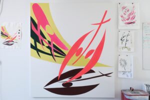
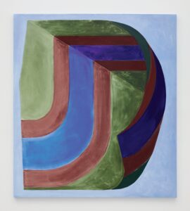
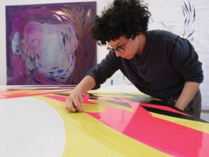
In Edgeways, a large painting hanging on her studio wall at FAWC, a fluorescent orange form angles upward at a diagonal as if it’s about to float away. The shape is an abstraction of a labrys, a double ax associated with the Amazons in Greek mythology and later adopted as a symbol of lesbianism in the 1960s and ’70s. “You don’t have to read the form, but I hope there’s a resonance of its attitude,” says Levine.
Underneath the orange form is a dark, purplish-red shadow. This color, created from Iron Glimmer Violet pigment, conveys a heaviness that seems to anchor the orange shape and prevent its ascent.
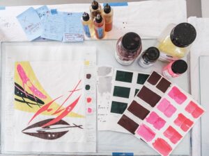
Levine still gets many of her pigments, which look like colored powder, from Kremer. To turn the pigment into paint, she mixes it with a binder, a glue-like material that helps the paint stay affixed to a surface, and medium, a combination of oils, resins, and solvents that adjusts the consistency and finish of the paint. She experiments with different mediums, using things like walnut oil, varnishes, and synthetic paint thinners. In this case, Levine added linseed oil and a hard-drying glossy medium to the violet pigment. It gives the color a thick, shiny body.
“It almost has the feeling of a sign painting,” says Levine. The color feels durable, viscous, and impenetrable; it’s a dramatic contrast to the buoyancy of the orange shape.
Levine is systematic in her approach, often keeping detailed notes of all the recipes used in a single work. For Edgeways, she began with a sketch and then worked out multiple iterations of the composition on paper, exploring how different pigments and mediums would react. To achieve the right effect for a violet shadow and a forest-green color used elsewhere in the painting, Levine made a chart where she mixed each pigment with different mediums. For the green, made from a Cobalt Bottle Green pigment, she landed on a matte finish that feels organic and earthy and highlights the brush strokes.
The orange color, created from Fluorescent Pigment Flame Red, proved trickier to manipulate, which Levine has noticed in other synthetic pigments that were developed for standard commercial use. She ended up applying it to the final painting with a linseed oil and dammar mix, which is midway between gloss and matte finishes and relatively transparent. “If a pigment is more transparent inherently, I’ll use a medium to accentuate that transparency,” she says.
After Levine made her studies and decided on her pigments and the right medium to pair with each, she performed one more critical step before applying paint to the canvas. Most painters today prepare a canvas with an acrylic gesso as a ground. Levine didn’t take the easy path. She created three different grounds from pigments, powdered chalk, and a binder. The grounds ranged from bright white to beige, and she applied them to the canvas according to what colors would be painted on top of them. For the orange form, she chose the brightest white for her ground to accentuate its brilliance.
“I wanted it to be as eye-scathing as possible,” says Levine.
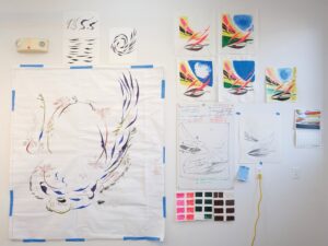
On another wall, Levine is working on a purple painting with a circular motif of abstracted images of Queen Anne’s Lace and mouth-like shapes. For this work, she started playing with stains and finishes rather than approaching it systematically as she did with Edgeways. Yet the imagery is built methodically through a series of sketches, including a full-scale drawing hanging next to the painting. The paintings and studies reveal not only Levine’s technical skills in manipulating materials but also her gifts as a playful and inventive image-maker who is able to break down forms and symbols, reinventing them in compositions full of movement.
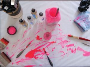
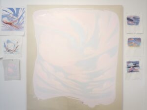
In Provincetown, the landscape has begun to seep into Levine’s work. She’s developed a habit of making watercolor studies of the sky during sunrise and sunset. In one large pink painting of swirling clouds, she meditates on the interdependence of materials and imagery.
“My work tends to be graphic and flat,” says Levine. “I wanted the challenge of incorporating more atmosphere.” The painting’s warm pigments, light-pink ground, and matte mediums work together to embody the airy atmosphere of a sunset.
Levine’s embrace of the landscape is emblematic of the open borders in her practice. While many painters work within increasingly narrow parameters, Levine’s curiosity is seemingly insatiable, both in terms of images and materials. With every artwork, she sees an opportunity to deconstruct both an image and the material components of a painting and then construct something entirely new from the elements — “to see, unsee, and see something completely different,” she says.
Motion and Motif
The event: A showcase with Dani Levine, José De Sancristóbal, Kai Conradi, and C. Mallon
The time: Friday, March 21, 5 to 8 p.m.
The place: Fine Arts Work Center, 24 Pearl St., Provincetown
The cost: Free